The problem
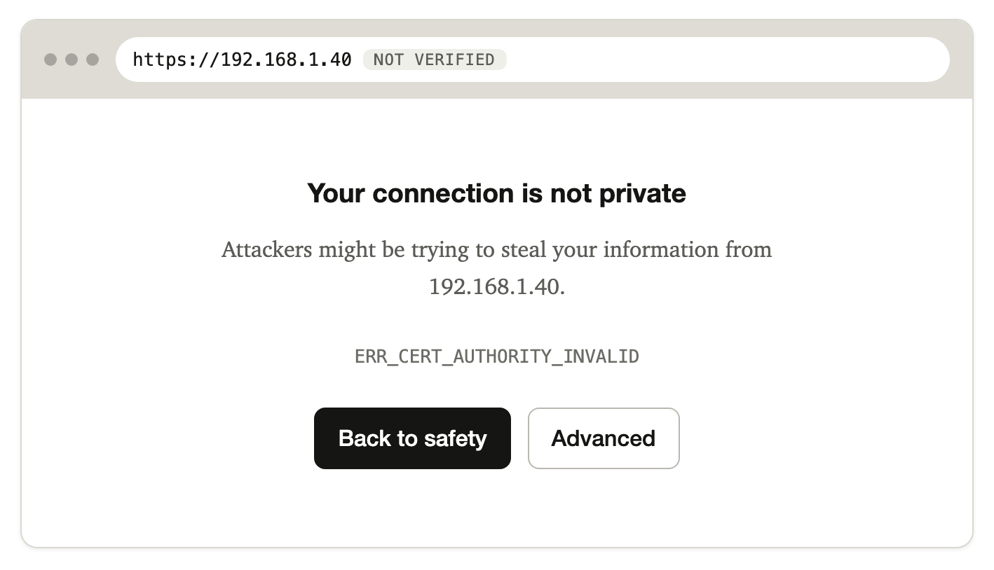
Inside any company network, people meet the same browser warning every day: on the office printer, on an internal tool whose certificate was renewed, on a corporate network that inspects traffic. Each time it says someone may be attacking them. Almost every time, nobody is. It's the same problem as alert fatigue in a SOC: a signal that fires on everything stops being read.
My study clicked-through coded 76 items from Hacker News threads about security warnings. I expected to find people weighing risk and proceeding anyway. Mostly I found something else: a warning that cannot be obeyed.
A browser tells you a certificate can't be trusted while you are connecting to a printer on your own network. There is no compliant answer, because a device on a private address can't get the kind of certificate the browser checks. People click through every day, learn the warning means nothing, and the one time it does mean something it looks the same.
Stated as a design problem: browsers collapse several different situations into one screen with one meaning. The browser already knows most of what it needs to tell them apart, whether the address is private, whether it has been here before, whether the certificate changed and who issued it, and it throws that away.
Who it is for
People who reach devices and services on networks whose certificates they don't control: developers, people running home or small-office equipment, staff on managed networks, students on campus wifi. The research population was technical, so the design makes no claim about non-technical users.
What success means
Not fewer click-throughs. The study's point was that "the warning went away" is a bad goal. Success is that people understand which situation they are in, that the changed-certificate case is not dismissed, and that routine cases stop firing once someone has made a considered decision.
From evidence to principles
I turned the coded findings into seven principles. Each cites the items it rests on, and a script checks that every cited item exists and carries the code claimed, so no principle can outgrow its evidence.
- Name the compliant path, or say there isn't one.
- Say what situation this is, using what the browser already knows.
- Treat frequency as a design parameter.
- Dismissal is not resolution.
- Route the problem to whoever can fix it.
- Save loudness for change.
- Warn at the moment of harm, not at a proxy for it.
One warning per situation
The core decision was to give each situation its own warning rather than keep one warning with help hidden under "Advanced". An Advanced section keeps the headline's single meaning, that someone may be attacking you, and asks people to discover it doesn't apply.
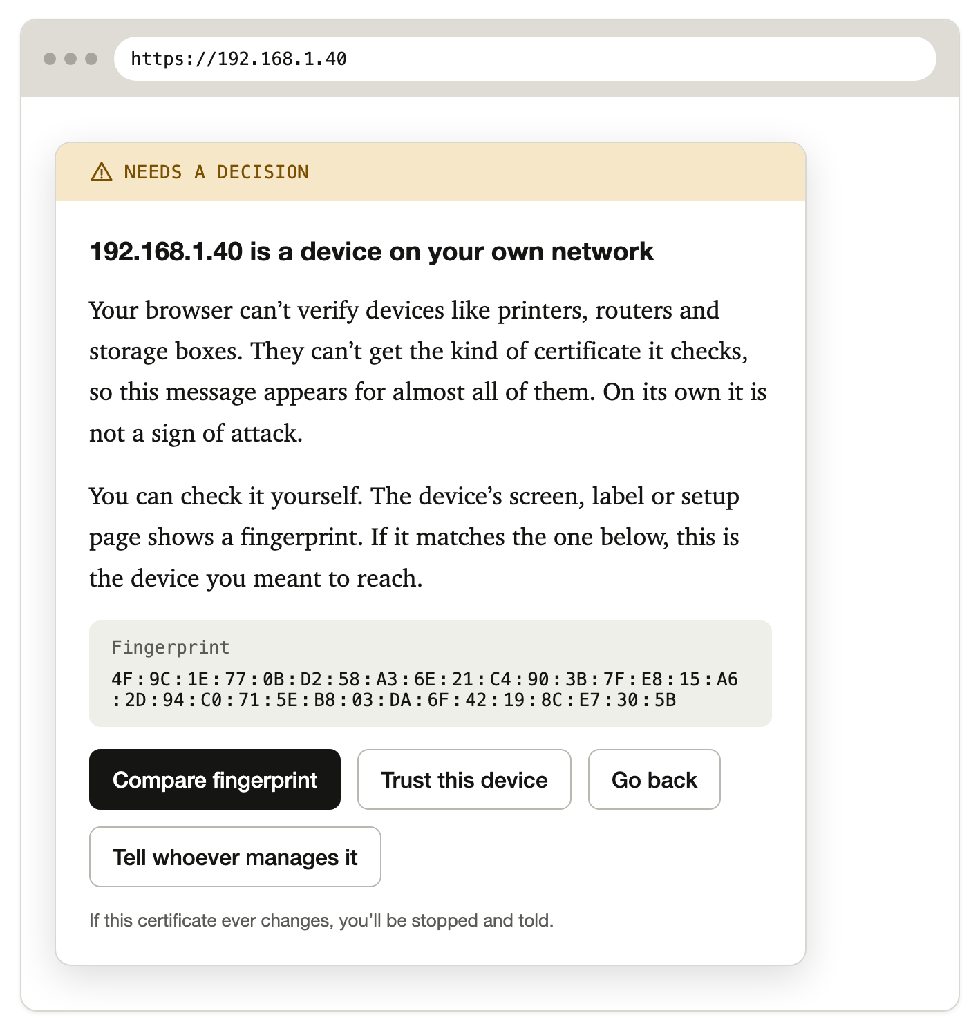
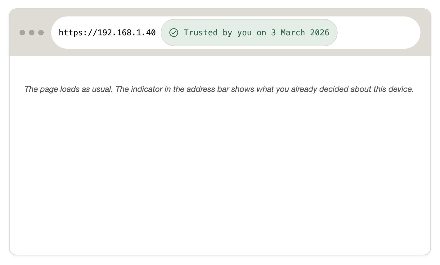
Spending attention where it carries information
The redesign is quieter where today's warning is wrong, and stricter where it is right. When a device you trusted presents a different certificate, that is exactly what an attack looks like, so there is no proceed button on the first screen. The only way forward asks for characters printed on the device itself, which only someone with physical access can see.
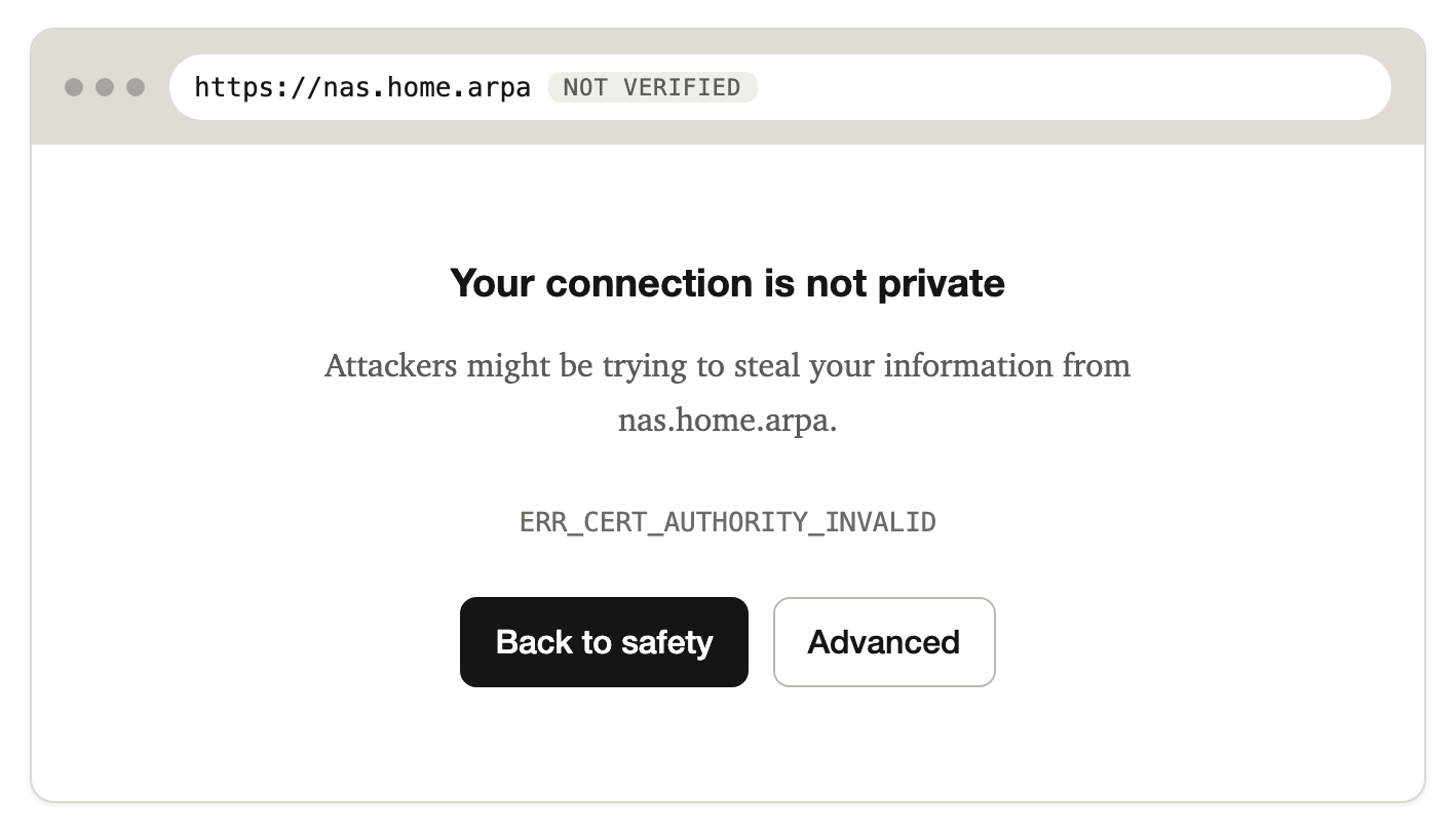
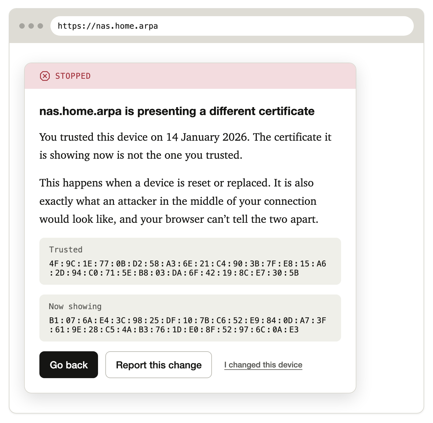
I rejected the most common fix for click-through, which is adding friction to the proceed path (hiding it deeper, countdowns, typed phrases). The evidence shows what friction produces when no compliant path exists: people build worse workarounds. One supplier shipped a single certificate and private key to thousands of machines to get rid of the red X. So friction only appears where it carries information, as in the changed-certificate case.
The other situations
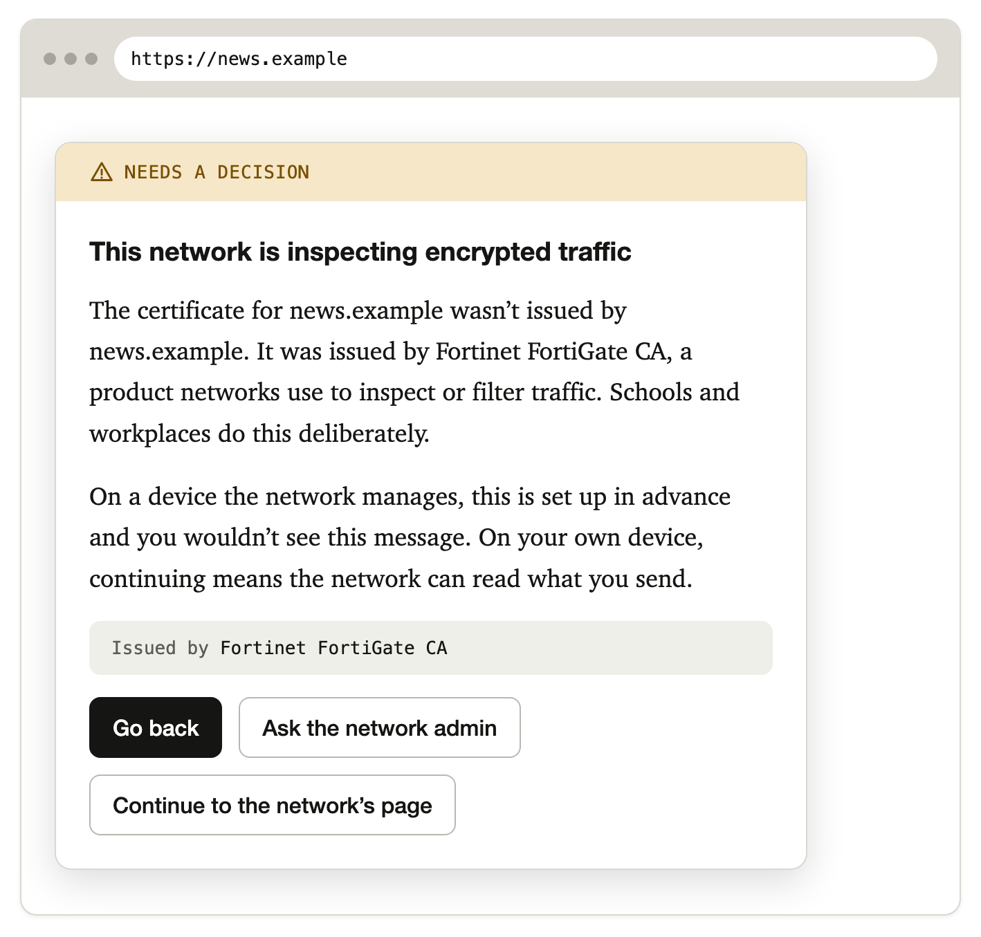
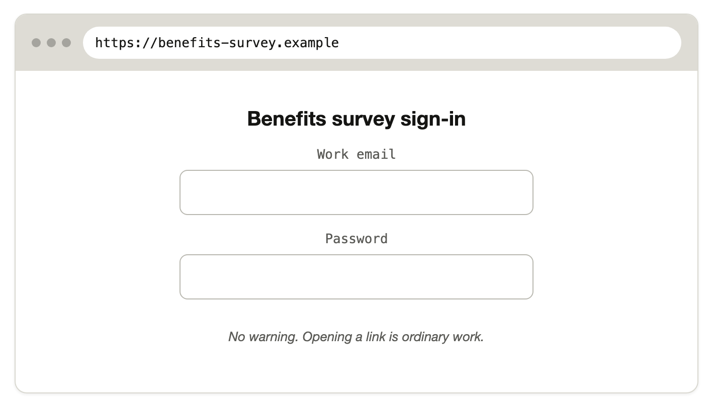
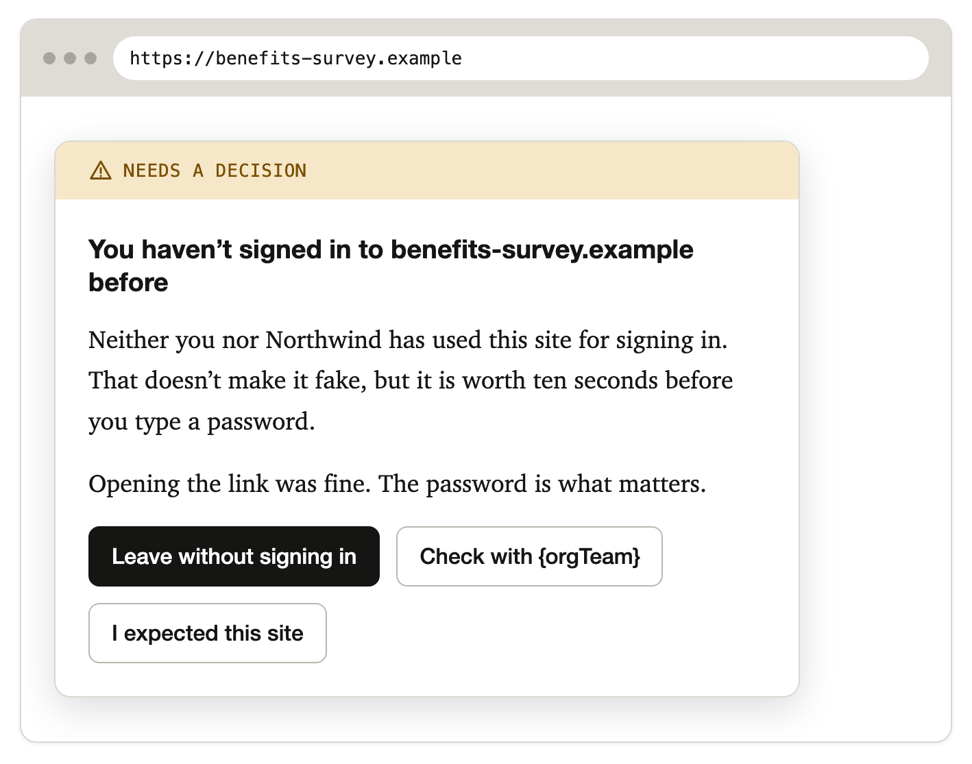
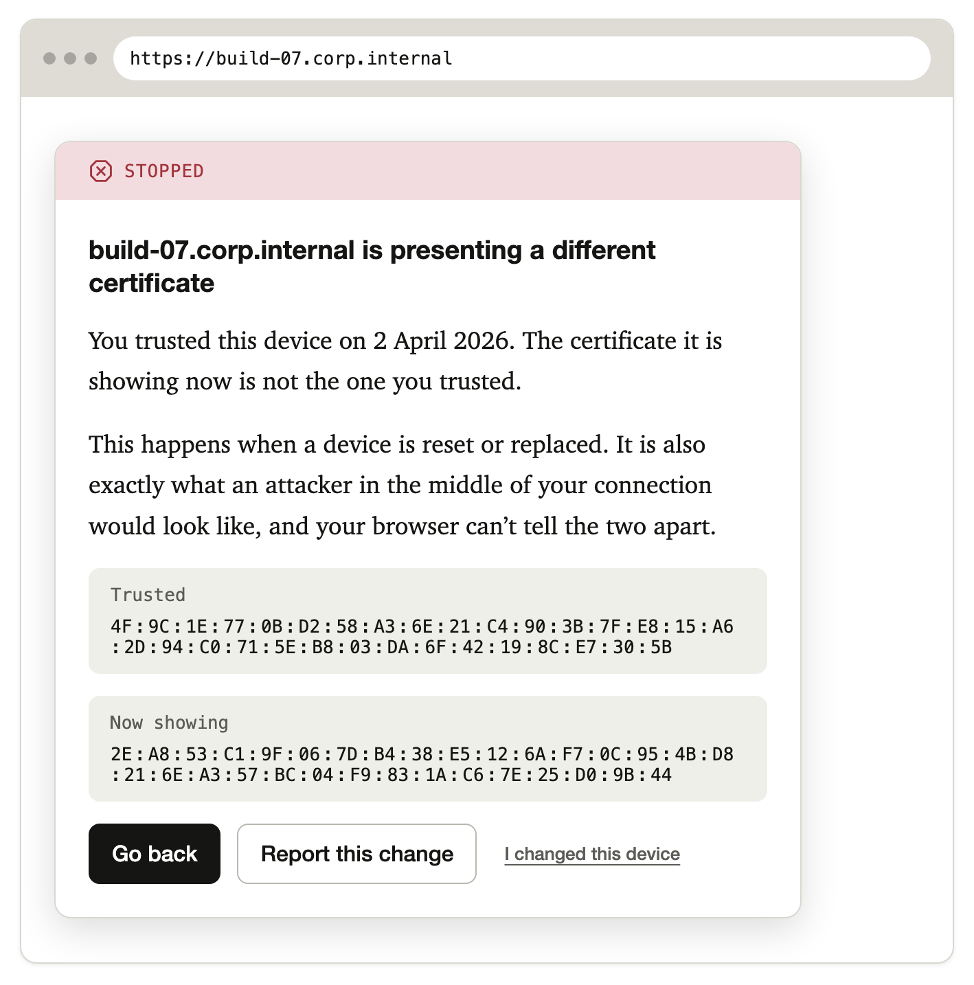
Decisions I'd defend
- Trust is remembered per host and per certificate, so a swapped certificate is never silently accepted.
- The words are "verified", "not verified" and "trusted by you". Nothing is ever called "secure".
- Every report names who it goes to and shows what it will send before sending.
- Code is the design medium. Most of this design is behaviour across visits, which a static frame can't show. Building it forced the logic into one tested function where every branch names the principle it implements.
A component built to ship
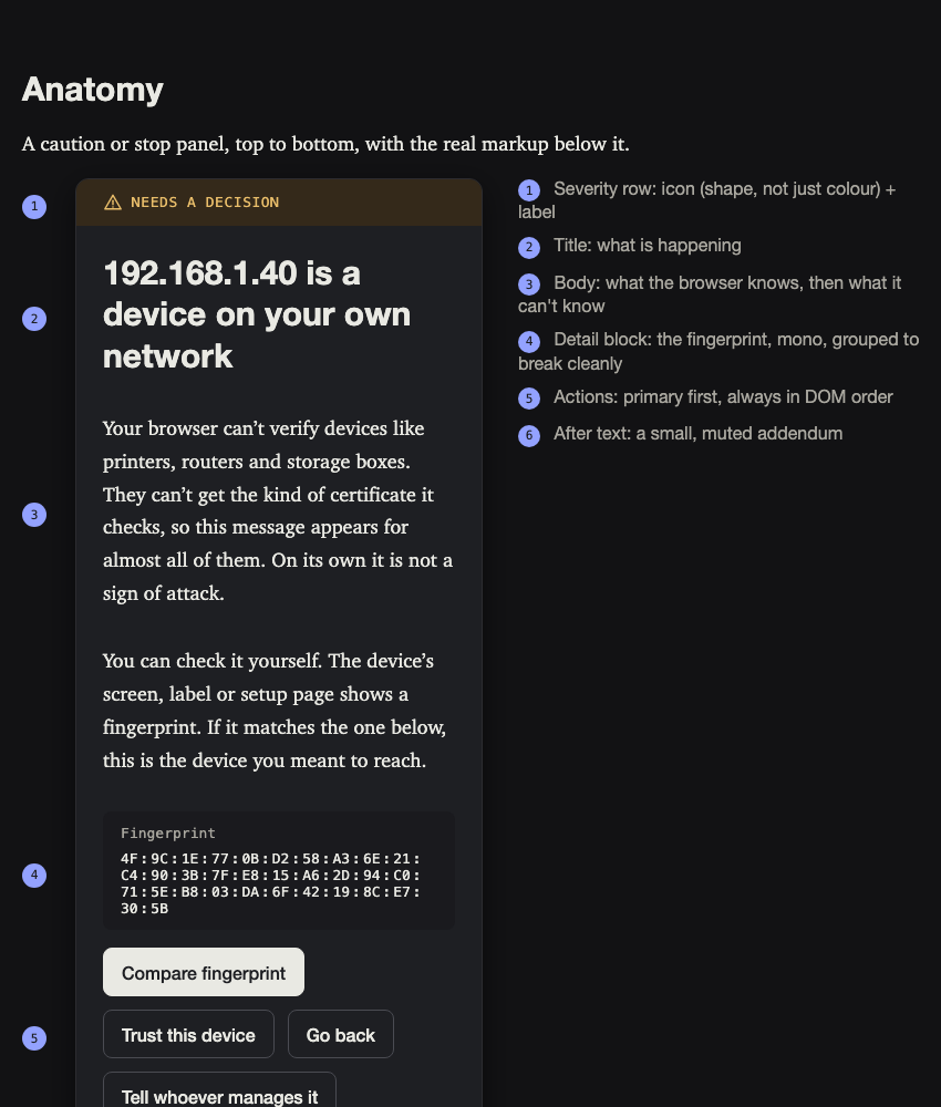
<trust-warning> is a web component with no dependencies and no network requests, accessible to WCAG 2.2 AA, with documented anatomy, states, API, copy rules and keyboard and screen-reader paths.
How I'd test it
The study is designed and the harness is built. It has not been run. Four questions: do people understand which situation they are in, is the changed-certificate warning dismissed less, do people use the report when someone else needs to act, and does any warning get weaker where today's is right. Target 24 participants matched to the study population, each seeing all four tasks in a counterbalanced condition.
One hypothesis matters most because it is the easiest to drop if results are inconvenient: on the printer task, proceed rates should not fall. The redesign is meant to make a reasonable decision easy, not to deter it.
Honest limits
- Not evaluated. Nothing here shows the redesign works yet.
- The evidence comes from one technical, English-speaking forum.
- The strongest move, the changed-certificate case, has the thinnest evidence: it is argued for in the corpus but never observed.
- Public sites with invalid certificates keep today's full warning. The redesign weakens nothing where an attack is the likeliest explanation.
What I'd do next
Run the study with 24 participants, starting with the changed-certificate task, since it carries the most risk and the least evidence.
Hiring a designer who does his own research?
I'm looking for a Senior UX or Product Designer role. Happy to walk you through this piece.